GEMELLii Branding
La Dolce Vita
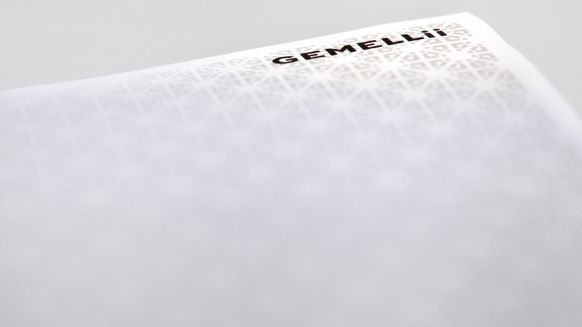
Take an i, put it at the end of the Italian word for "twin" and get: GEMELLii. Admittedly, it wasn't quite that simple. As the new premium tonic water on the market, GEMELLii stands for selected ingredients and the highest quality. With a corporate design in a premium look, we pick up on these core factors and also bring the founders into play once again. Because: The catchy double-i is not only the basis of the design pattern, but at the same time represents the Italian-German founding twin brothers.
The double i set as the core element, multiplied together, forms the typical GEMELLii pattern.
The website's mirrored and scroll-dependent images also consistently contribute to the twin principle.


Questions about the project?

Rohwa Jung


