- Branding
- 2024
Every piece a story
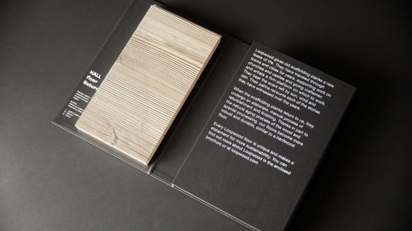
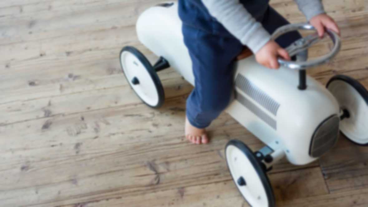
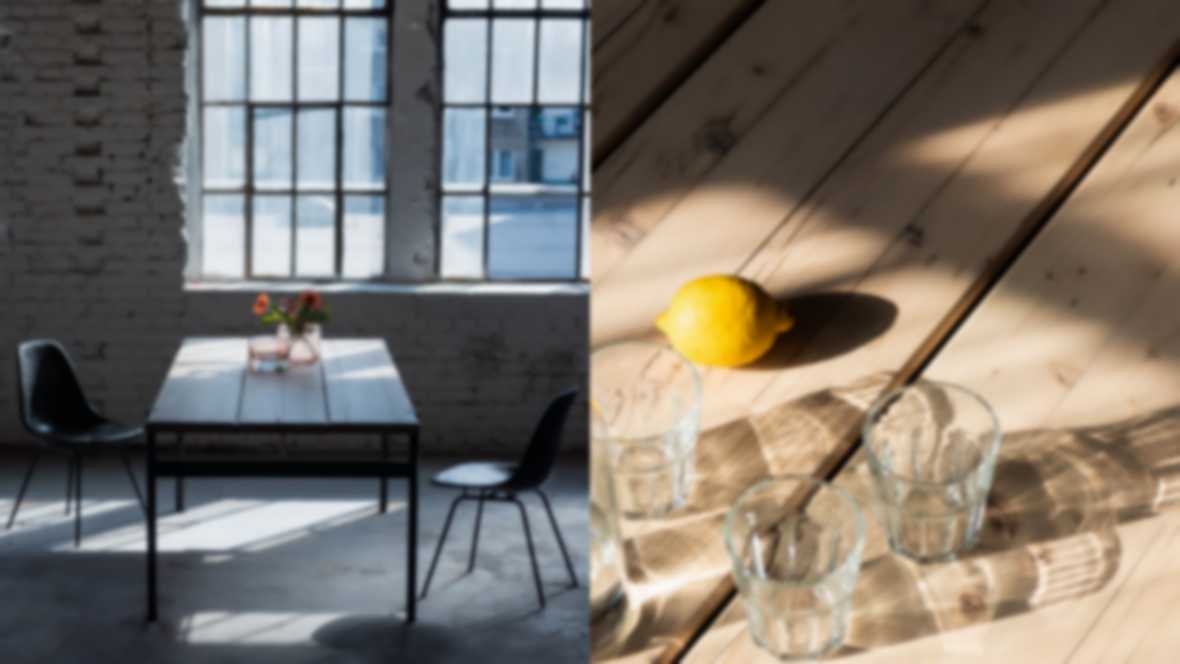
Loopwood gives old scaffolding planks a second life as high-quality furniture and flooring in line with the cradle-to-cradle principle. We have given the new Schollmayer Holz brand a visual identity - with branding and design that tells the unique story of the material.

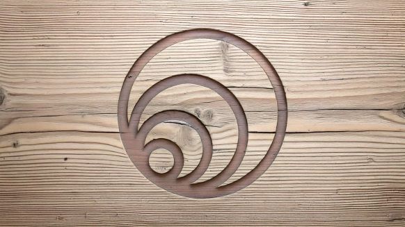

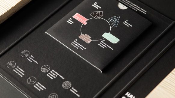
The circle is at the center: the letter "o" in the word mark and the tree rings in the figurative mark symbolize circularity and organic growth.
We supported the entire development process with consulting, conception, design and shooting. The image film planned and produced by us places the story of the floorboards at the emotional center.
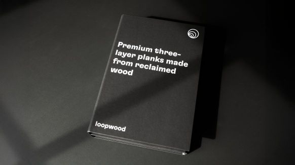
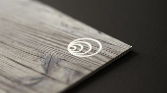
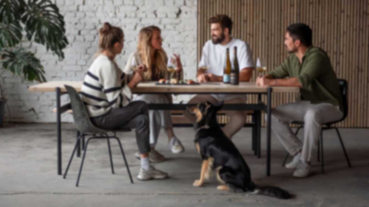
Haptically high-quality products that combine history with design and functionality - that's what Loopwood stands for. We underline this with high-quality print products made from recycled paper and finishes such as blind embossing. The sample folder shows what it looks like when sustainability and a timeless design form a unit.
From the typography, imagery and animations to the UX design concept: the newly developed elements and principles tell the story of the brand on the website.
With the branding, we have managed to translate the characteristics of wood - rough, warm, durable - into a holistic and emotional experience.Marcel Teine, CEO of 3st

Questions about the project?